 Well, it looks like it's pretty close to official: in another step towards remaking the Tampa Bay Devil Rays, team management has received permission from Major League Baseball to change team colors to blue and gold and change the team's name officially to Rays next year. This bothers me for a couple of reasons. For starters, I used to work for the Rays in a couple of different capacities, including writing a feature column that ran on their web site, and enjoyed doing so. So I feel a twinge of nostalgic sadness whenever they change anything now (although, strangely, I didn't feel all that nostalgically sad when they removed my old columns, especially the one I wrote where I heralded the arrival of Joe Kennedy as something akin to the second coming of Sandy Koufax. Ouch). Plus, I'm a traditionalist and I don't believe teams should ever change their colors and this will be the second such change in the team's 11 year history. Although, the first time was less a change than a narrowing down, since the original colors were basically three quarters of the entire rainbow.
 And you certainly don't change your name. Everybody already calls them the Rays anyway.
I really hope they're just making it official for convenience sake and not as some concession to the occasionally vocal people who find the word "devil" offensive because that would just be silly. After all, the collective "we" (Tampa Bay fans) have been griping about the name since the day it was announced and not because of anything offensive: there would have been griping if the team had been called the Tampa Bay Best Baseball Team Name Evers (which would have been Dodgers, by the way, if it weren't already taken). We're fans. Griping is what we do! We like it and we're not going to stop so don't listen to us when it comes to stuff like this!
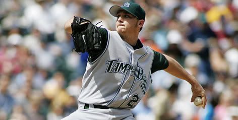
I'm also sad because I like the Rays (Devil or otherwise) uniforms the way they are. The Rays jerseys feature the nickname on the front of the home jersey and the city (ok, in our case, region or general vicinity) on the visitors jersey, like a good baseball uniform should. Just like the Giants, Cubs, Dodgers, Pirates and both sets of Sox among others. Of course, there's more to it than that. The Toronto Blue Jays meet that criteria and still have the worst uniforms in baseball. Their logo looks like it belongs to a brand of menthol cigarettes from the 70's (Smoke Jays; They're smooth and refreshing!).
And back to colors, there are currently only two teams that wear green, us and Oakland. Meanwhile there are 17 teams that prominently feature some shade of blue in their uniforms. How boring. Between changing the name and altering their appearance to blend in with others, it's like the Rays are entering baseball's witness relocation program.
I say forget all that. If there have to be changes, keep doing what you're doing to the Trop (the fact that it's clean now illustrates how filthy it used to be). If you want something blue, maybe paint the turf. I mean, it's a domed ballpark. We know it's not real grass. Who says it has to be green? Oh yeah. And get us some relief pitchers. Any color you want, as long as they can hold a five run lead for one inning. Thanks.


No comments:
Post a Comment